What is banner advertising
Written by Emma Sharp on 13 minute read
Find out everything you need to know about banner advertising with this comprehensive guide, including the advantages and disadvantages of this type of ad.

What is a banner ad?
A banner ad, also known as a display ad, is an online advertisement that’s displayed on a website. Banner ads can be in either JPG, GIF, PNG, or HTML5 format. You’ll see banner ads on a wide variety of websites – and just about any website publisher is able to host them. In some cases, the businesses being advertised may be relevant to the onsite content, in others, it may be targeted at specific users, or in some cases, they’re almost completely random.
Banner ads can be a significant source of income for publishers and a significant source of exposure for advertisers, as well as being a great addition to digital and affiliate marketing campaigns.

How does banner advertising work?
Banner ads are placed in high-visibility areas of high-traffic websites, where they are most likely to be seen by an advertiser’s target audience. The ad space is paid for by the advertiser, either through advertising networks or by setting up a direct agreement with the owner of the site the advert will live on.
A banner ad is also a link; a user can click a banner ad and go to your homepage, a product page, landing page – or whatever you see fit for your conversion goals. As an advertiser, the cost of getting a banner ad published can vary depending on the size, the market, the websites you’re looking to be featured on, and more. Banner advertising operates on various pricing models, including Cost Per Click (CPC), Cost Per Mille (CPM), or Cost Per Acquisition (CPA).
What makes banner advertising effective?

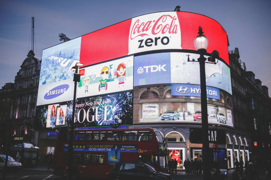
Banner ads are effective because, when done well, they’re simply hard to ignore. Oftentimes, a good banner ad will be the first thing your eyes are drawn to when you open a webpage. They’re similar to billboards, only digital.
Banner advertising is most effective when trying to raise brand awareness. While they could be used to market to existing customers, particularly with remarketing distribution, banner ads typically perform best when the aim is to simply get new eyes on the business.
You might also use banner advertising to create awareness around a special offer or sale. For instance, you could offer an exclusive discount for a product or a free trial for a service to those who click through. This works great with remarketing – the user has already shown some interest, so now you can close the deal by advertising a special offer directly to them.
The ultimate goal is to persuade users to click on your ad, generating traffic to your website. In order to do so, you have to ensure your ad is eye-catching, unique, and enticing. Great banner adverts are often those that include one or other of:
- A sense of urgency: while stocks last, limited time only, 24hr sale.
- A sense of humour: puns and playing on popular phrases, entertaining visuals.
- A unique selling point: visuals and copy that make it clear why the product or service is unique.
- Eye-catching content: bright, bold or unusual content that draws the eye to the banner ad, rather than elsewhere on the page.
Getting people’s attention isn’t the whole story, though. Keep in mind key factors that turn ad views into ad clicks and purchases, including:
- Relevance: Ads should be relevant to the content and the audience of the website or app where they are displayed.
- Call-to-action (CTA): Including a clear CTA in the ad encourages users to click through, whether it’s to find out more or to make a purchase immediately.
- Targeting: Precise targeting for your ads based on demographics, interests, and behaviour can increase the chances of reaching the audience you want, and the audience that will convert.
Banner ad examples
Static banner ad examples
Ridge RFID-blocking wallets: clever use of visuals

This is a simple example of a banner advert which uses an effective static visual to demonstrate how this product solves a problem for the user. The ad copy is short and simple, and the accompanying imagery encourages viewers to make an immediate comparison between their existing purchase and this potential new one.
Lexus: eye-catching - literally

Proof that you can grab people’s attention even when using fairly generic or stock imagery, this Lexus advert puts the eyes in eye-catching with a static banner ad designed to make you stop and stare. Rather than promoting a product, this ad focuses on emotion and inspiration, encouraging viewers to click through to find out more.
Rich media banner ads (ensure these are uploaded as gifs, not images!)
IBM: What’s behind the door? Gif

This ad doesn’t show a product or use urgency, but it does draw the eye thanks to the waving arm of the cartoon man within. Once the viewer’s attention has been caught by the motion, simple copy drives users to click and see ‘behind the door’ via the Go Now button.
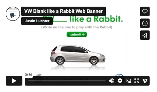
Volkswagen: like a rabbit video banner

Interactive adverts can really stand out when done well, and they also give people a reason to engage with what you’ve produced for a longer period of time. VW’s like a rabbit idea is tongue-in-cheek as well as engaging, with a clear CTA and a playful functionality.
Banner advertising sizes
You may assume that the bigger the banner ad, the better its chances of generating impressions, but this isn’t necessarily the case. A banner ad that’s so big it becomes obtrusive might garner a negative reception and feel spammy, and larger banner ads are less likely to be placed on more well-known, trusted websites.

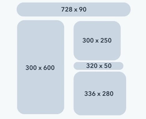
Below are the standard sizes for banner ads:
Standard Formats
- Banner (468x60)
- Leaderboard (728x90)
- Medium Rectangle (300x250)
- Wide Skyscraper (160x600)
- Skyscraper (120x600)
- Small Square (200x200)
- Square (250x250)
- Half Page (300x600)
Mobile Formats
- Smartphone Wide Banner (320x50)
- Smartphone Static Banner (300x50)
- Medium Rectangle (300x250)
- Smartphone Large Banner (320x100)
- Feature Phone Small Banner (120x20)
- Feature Phone Medium Banner (168x28)
- Feature Phone Large Banner (216x36)
While banner ads can come in a variety of sizes, you’ll likely have the most luck focusing on Medium Rectangle, Large Rectangle, Leaderboard, Half Page, and Mobile Leaderboard banner ads, depending on where your ads are going to be served and your brand’s design preferences. These are most common, and most likely to be successful.
Banner blindness: what it is and how to avoid it
Banner blindness is a popular term that refers to users' tendency to ignore banner ads - or, become blind to them - due to the frequency at which they are seen. In some cases, websites running a large quantity of banner ads become more susceptible to audience banner blindness, where a visual overload of many adverts at once causes the user to not fully comprehend any of them. As banner ads have become more and more prevalent, many of us have become so accustomed to them that they become easier to ignore.
It’s not too dissimilar from traditional advertising. When you’re bombarded with ads everywhere you turn, they can simply blend into the background. The same goes for TV advertising. We’ve gotten to the point where we’re conditioned to tune out once the adverts begin, and only the most compelling content will reel us back in. In order to make sure you really stand out; you’ve got to make sure you have a truly captivating visual.
Some things that can help include:
- Using native advertising as well as banner ads, to create a blend of visuals and formats.
- Roting ad creative regularly so that blindness to your ads, specifically, is not an issue
- Keep things simple: minimalist ad graphics can still be bold and eye-catching, so consider the right balance for your brand when it comes to creating powerful ads.

Tips for designing new banner adverts
- Including a clear call to action (CTA) in your display ads is a must. Whether it’s something like ‘Find Out More’, ‘Shop Sale’, ‘Save Now’, ‘Get Exclusive Offer’ – whatever you go for, a CTA can help guide a user towards conversion.
- Choose your link wisely. If you’re looking to raise brand awareness, you might link to your homepage or a blog. If you’re looking for sales, link directly to the product page. If it’s lead generation, link to a landing page where users can get a free trial or exclusive offer.
- Use the AIDA marketing model to guide your design approach. AIDA stands for attention, interest, desire, and action; aim for your display ad to achieve each of these points.
- Grab attention through your choice of colour, typeface, aesthetic, format, and structure.
- Gain interest with a bold statement that expresses the ultimate message of your product or campaign.
- Encourage desire through sub-copy and imagery that sells the KPIs of the product, using a style and tone of voice that speaks directly to your audience’s needs.
- Then, inspire action with a CTA.
Are banner ads outdated?
Like many forms of advertising, banner ads have evolved a lot in recent years and will continue to do so. Despite fears of ‘banner blindness’, banner ads are far from outdated, remaining a staple tool in many marketer’s everyday kits.
Native advertising, social media advertising and sponsored content are often considered to be less obtrusive ad formats, but banner ads remain a popular option for driving brand awareness as well as for driving sales. Whether individual adverts are seen as modern or outdated comes down to the creative copy and images used by the brands behind them.
The advantages and disadvantages of banner advertising
|
Advantages |
Disadvantages |
|
Increase brand awareness |
Can be intrusive |
|
Can drive new leads/sales |
Risk of banner blindness |
|
Typically low-cost |
Lower click-through rate than other ad formats |
|
Highly targetable |
Restrictions on sizing and contents |
|
Adverts are very easy to create |
Ad blockers can prevent ads from displaying |
|
You can have 100% control of placements |
Results are not guaranteed |
What to remember when you’re creating banner ads
If you’re a publisher, you don’t want to irritate your audience with huge ads that distract too much from your content. While you may earn more from having more, larger banner ads, you need to be careful not to damage your reputation by going overboard. Always keep user experience in mind and make sure your banner ad placement benefits all parties – you, the advertiser, and the user. Remember:
- Focus on relevance and targeting.
- Experiment with different ad formats.
- Monitor performance and make adjustments as needed.
Banner advertising with Awin
Awin facilitates the process of publishing and distributing ads online for both publishers and advertisers alike. Advertisers can use My Creative to manage and upload their banner marketing material, creating a database for publishers to find relevant content for their site. Some affiliates on the Awin network are also remarketers, so advertisers can connect with these affiliates to serve their content to users who have engaged online with the business before.
Through the platform, publishers and affiliates are able to populate spaces on their websites to host ads. Publishers are provided with an HTML script that can be added to their website, and ads can then be added and automatically updated without the publisher needing to do anything. These are specific per retailer and can be chosen by size and format.
Publishers can also search by content type, topic, advertiser and more, to connect with the best banner ads for their brand. They will then be paid a commission based on the number of conversions the ad generates.
Check out our Awin feature comparison to find out more about how Awin can support your marketing needs.


